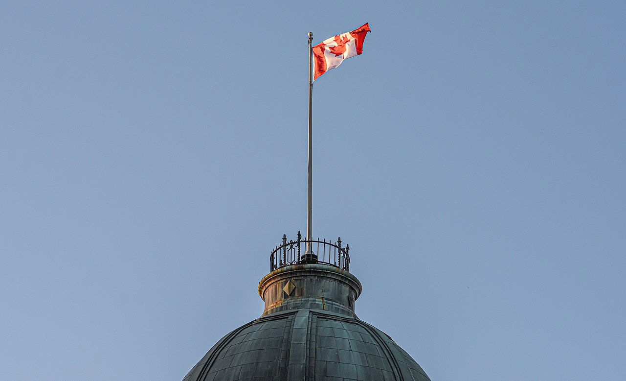
Sixty years ago, the maple leaf was raised for the first time as Canada’s official flag. On February 15, 1965 it replaced the Red Ensign and Union Jack.

Not all Canadians liked the new flag, nor saw the need for one. My father continued to fly the Red Ensign. The Ontario and Manitoba governments shared his sentiment, making variants of it their provincial flags in 1965.
Many designs were considered – pretty much all of them, to my eye, dreadful. So I’m glad the single maple leaf and two colour design was selected.
As its designer said, “it can be easily recognized at a distance.” It’s also easily recognizable in miniature.

George Stanley
George F. G. Stanley (1907-2002) designed the maple leaf flag. From Alberta, he was a history professor at Mount Allison University in Sackville, New Brunswick and at the Royal Military College of Canada in Kingston, Ontario. From 1981 to 1987, he was Lieutenant Governor of New Brunswick.

During the flag debate of 1964, Stanley was dean of arts at the Royal Military College He looked at the school’s flag, and thought it provided a good basis for a national flag. Just replace the crest in the middle with one stylized maple leaf.

Flag Design
Prime Minister Lester Pearson’s preferred design had a band of blue on either side to represent the two oceans, and three red maple leafs in the middle.

Opposition leader John Diefenbaker wanted to keep the Red Ensign. But failing that, he wanted something with a Union Jack and fleur-de-lys somewhere in it.
Their choices were about telling a story through the flag. So too were many other designs in the competition. The history, geography or demography of Canada. But telling a story in a relatively small piece of fabric is always going to leave something or someone out. For sure, it is going to be cluttered.
A flag is for its own people, of course, to rally around. It’s also for others to recognize us. Similar colour combinations and intricacy of design can make flags difficult to distinguish. You shouldn’t need to google a flag to know whose it is. That is what George Stanley saw: keep it simple, both story and image.

- For more on George Stanley and his “distinctive Canadian symbol,” see The Canadian Encyclopedia. Part of Stanley’s 1964 letter as well as more on the alternate designs and debates is in a 2020 CBC NB article.


Kim Moore
17 Feb 2025I remember thinking the red bands should be blue, if they were to represent the two oceans. But, I now see how distinctive the flag design chosen is. Two colours. Simple design. It stands out.
Dorothy
17 Feb 2025It might work, if Pearson’s design had a deeper blue and the proportions of colour bands were the same as the final design – and keep the single maple leaf, not the three. Hard to know because we’re so used to the red and white now. Simple is the key, though. Thanks, you’ve made me rethink the blue bands.